Item Settings
This content setting option for Woocommerce Design.
Item

- Display No. of Product: You can select a number of Product to show.
- Show Image: You can show or hide an Image of Product.
- Image Size: You can select a size of Product Image.
- Show Title: You can To show or hide the Title of Product.
- Show Description: You can hide, show short or full Description of Product.
- Show Sale Price: Here, you can show or hide the Sale Price of Product.
- Show Regular Price: Here, you can show or hide the Regular Price of Product.
- Show Rating: You can show or hide the rating of Product.
- Show Button: You can show or hide button.
- Show Custom Button: You can show or hide custom button text for different product.
- Simple Product Text: You can set the text of Simple Product Button.
- Grouped Product Text: Here, you can set the text of Grouped Product Button.
- External/Affiliate Button Text: You can set the text of External/Affiliate Product Button.
- Variable Product Text: Here, you can set the text of Variable Product Button.
Products Query
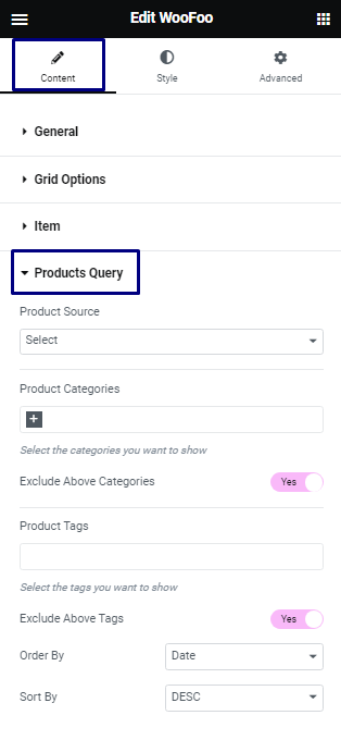
- Product Source: You can select product source like Best Selling, Top Rated, Sale and Recent product.
- Product Categories: You can select product categories.
- Exclude Above Categories: Here, you can exclude or include product by selected categories.
- Product Tags: You can select product tags.
- Exclude Above Tags: Here, you can exclude or include product by selected tags.
- Order By: You can show product by Order.
- Sort By: You can how product by Sort.
Product Source
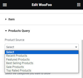
- Recent Products: You can show Recent Product from Product Source.
- Featured Products: You can show Featured or Favorite Product from Product Source.
- Best Selling Products: You can show Best Selling Product from Product Source.
- Sale Products: You can show Sale Product from Product Source.
- Top Rated Products: You can show Top Rated Product from Product Source.
Style Settings
The content settings are divided into various sections.
Item
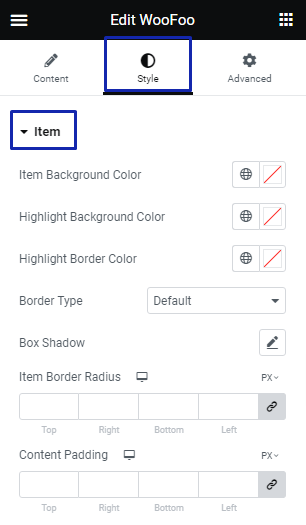
- Item Background Color: Here, you can set the background color of item.
- Highlight Background Color: Here, you can set the background color of highlighted item.
- Highlight Border Color: Here, you can set the border color of highlighted item.
- Border Type: You can set the border for item.
- Box Shadow: You can set the box shadow for item.
- Item Border Radius: You can set the border radius for item.
- Content Padding: You can set the padding for item content.
Image
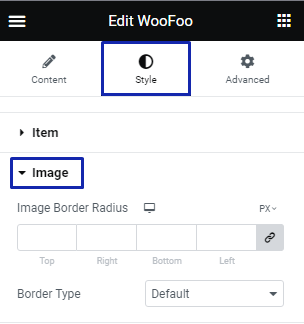
- Image Border Radius: Here, you can set border radius for image.
- Border Type: You can select border type for image.
Title
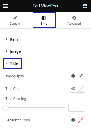
- Typography: Here, you can set typography for your title.
- Title Color: You can set the title color here.
- Title Spacing: You can set spacing for your title.
Description
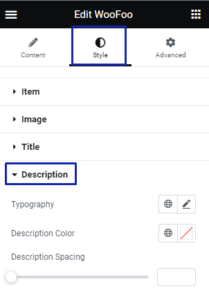
- Typography: Here, you can set typography for your Description.
- Description Color: You can set the Description text color here.
- Description Spacing: You can set spacing for your Description.
Price
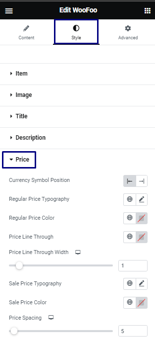
- Currency Symbol Position: You can set position of currency symbol.
- Regular Price Typography: You can set typography for your Regular price.
- Regular Price Color: You can set the Regular Price color here.
- Price Line Through: You can set line through Regular price.
- Price Line Through Width: You can set the width of line through for Regular price.
- Sale Price Typography: You can set typography for your Sale price.
- Sale Price Color: You can set the Sale Price color here.
- Price Spacing: You can set spacing between sale price and regular price.
Button
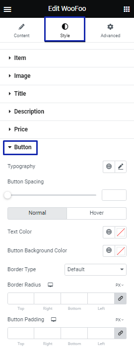
- Typography: You can set typography for button text.
- Button Spacing: You can set spacing for your product Button.
- Toggle button: You can select normal or hover by toggle button.
- Text Color: You can set the text color for button here.
- Button Background Color: You can set the background color for button.
- Border Type: Here, you can select border type for button.
- Border Radius: Here, you can set border radius for button.
- Button Padding: You can add padding for button .
Icon
![]()
- Icon Size: You can set the icon size.
- Icon color: You can set the icon color.
- Icon Background Color: You can choose an icon background color.
- Border Type: You can select the icon border type.
- Icon Border Radius: Here, you can set the border radius for icon.
- Icon Padding: Here, you can add padding for icon.
Rating
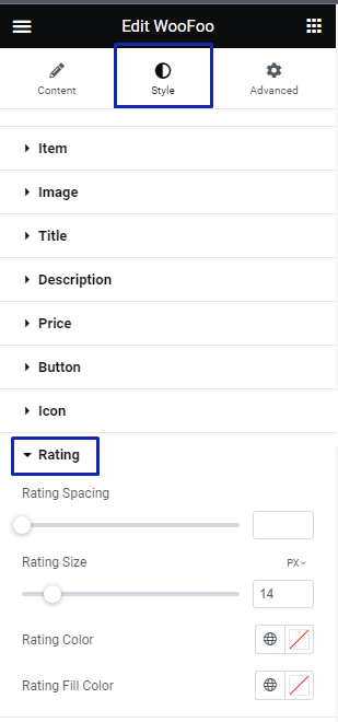
- Rating Spacing: You can set spacing for Rating.
- Rating Size: Here, you can set size of rating.
- Rating Color: You can set color of rating.
- Rating Fill Color: You can set color of fill rating.
Label
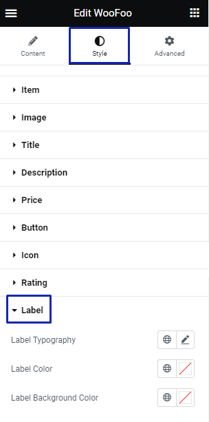
- Label Typography: You can set typography for label text.
- Label Color: You can set the label color.
- Label Background Color: You can choose an label background color.
- Border Type: You can select the label border type.
- Label Border Radius: Here, you can set the border radius for label.